PINKPANDA is a nail art aesthetic brand driven by fashion, art, and futurism. It provide customized nail designs and a welcoming service experience for women with independent and expressive aesthetics. Forget the rules and frameworks, keep curiosity alive; advocate for a carefree and self-expressive way of life.
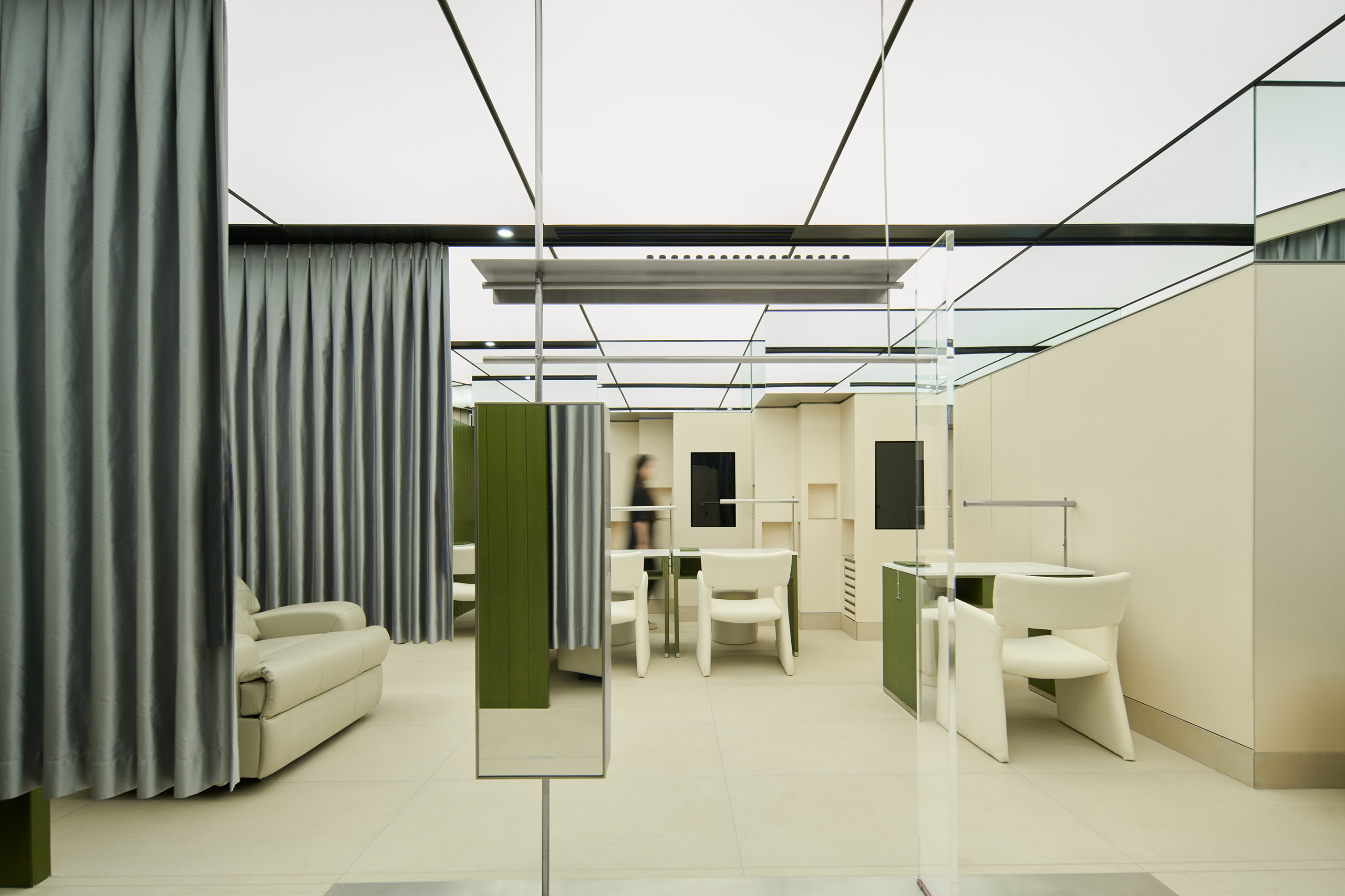
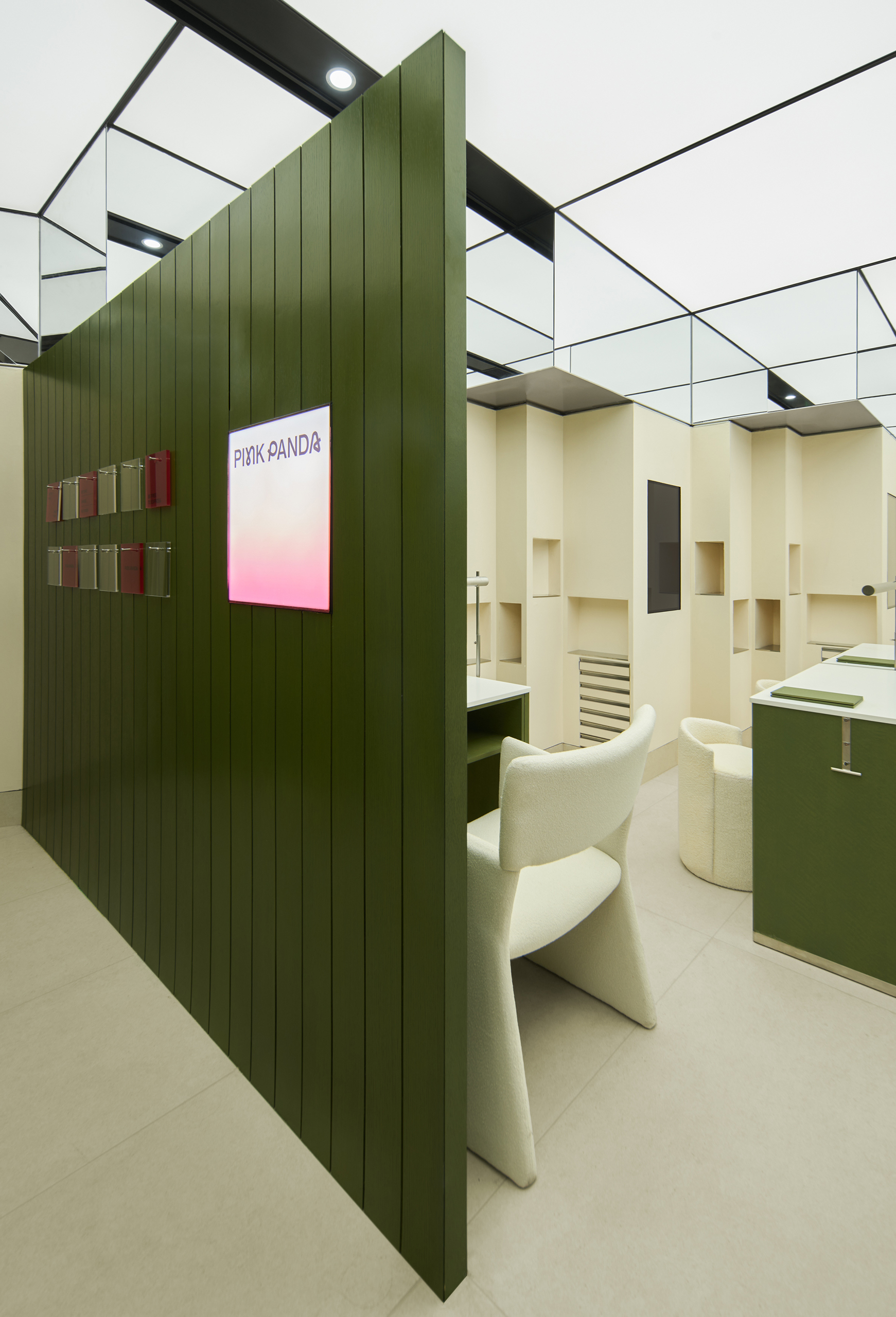
The space is a 60-square-meter square area. The client hopes to accommodate five nail stations and three eyelash stations while also having a small office space and a storage area. Additionally, they wish to ensure that there is no direct line of sight and minimal disturbance between the nail and eyelash areas. In order to achieve that, we broke the existing framework and rotated the original layout by 60 degrees. Ingeniously, we redirected the line of sight of eyelash clients towards the window, and the void created by the rotation accommodated the auxiliary functions perfectly.
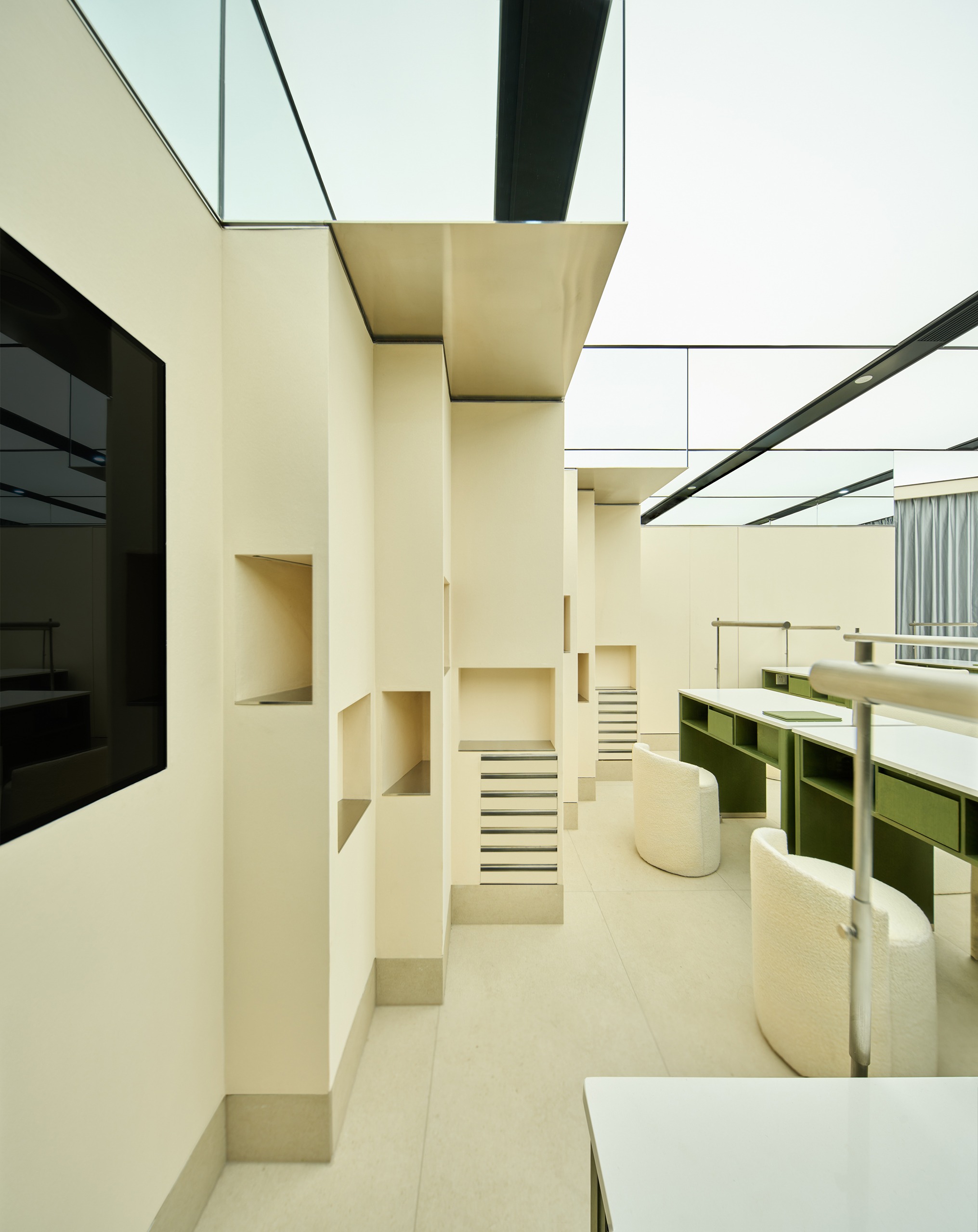
The rotation of the floor plan gives this originally straightforward space a “maze-like clarity.” Two slanted walls define the entrance space, making the customers cannot immediately grasp the scale and space of the interior. Stepping inside, a geometric beauty brought by the linear spatial syntax, while the central node device, placed at the visual focal point, forms a clear guiding path.
“Transparency however implies more than an optical characteristic, it implies a broader spatial order. Transparency means a simultaneous perception of different spatial locations. Space not only recedes but fluctuates in a continuous activity.” —— Rowe, Colin. (1964), Transparency.
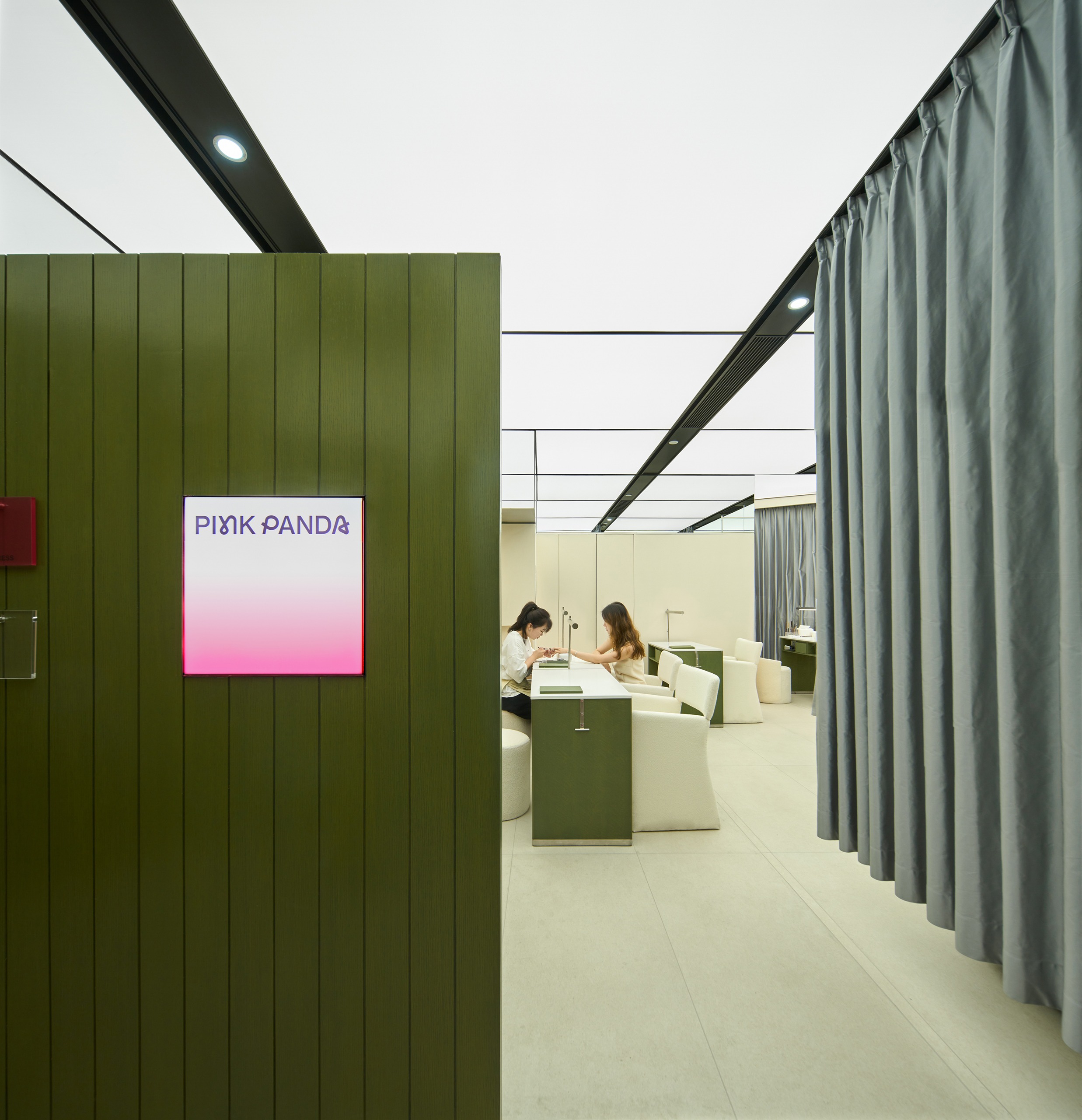
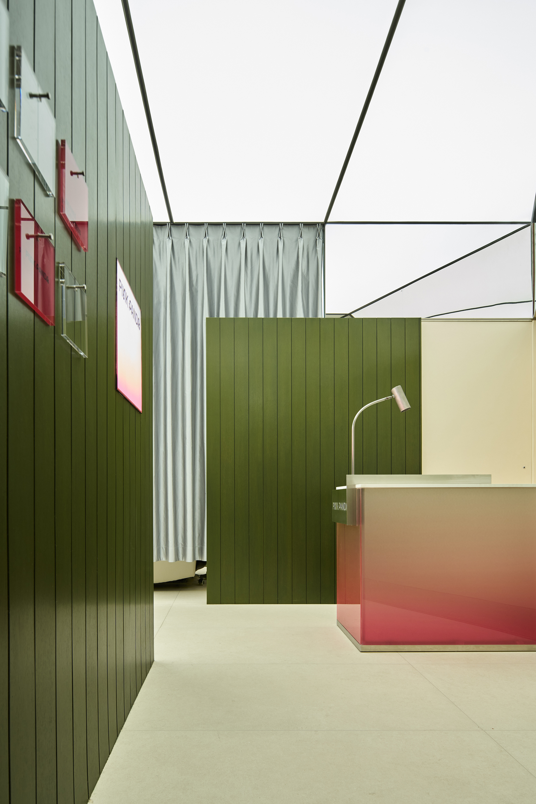
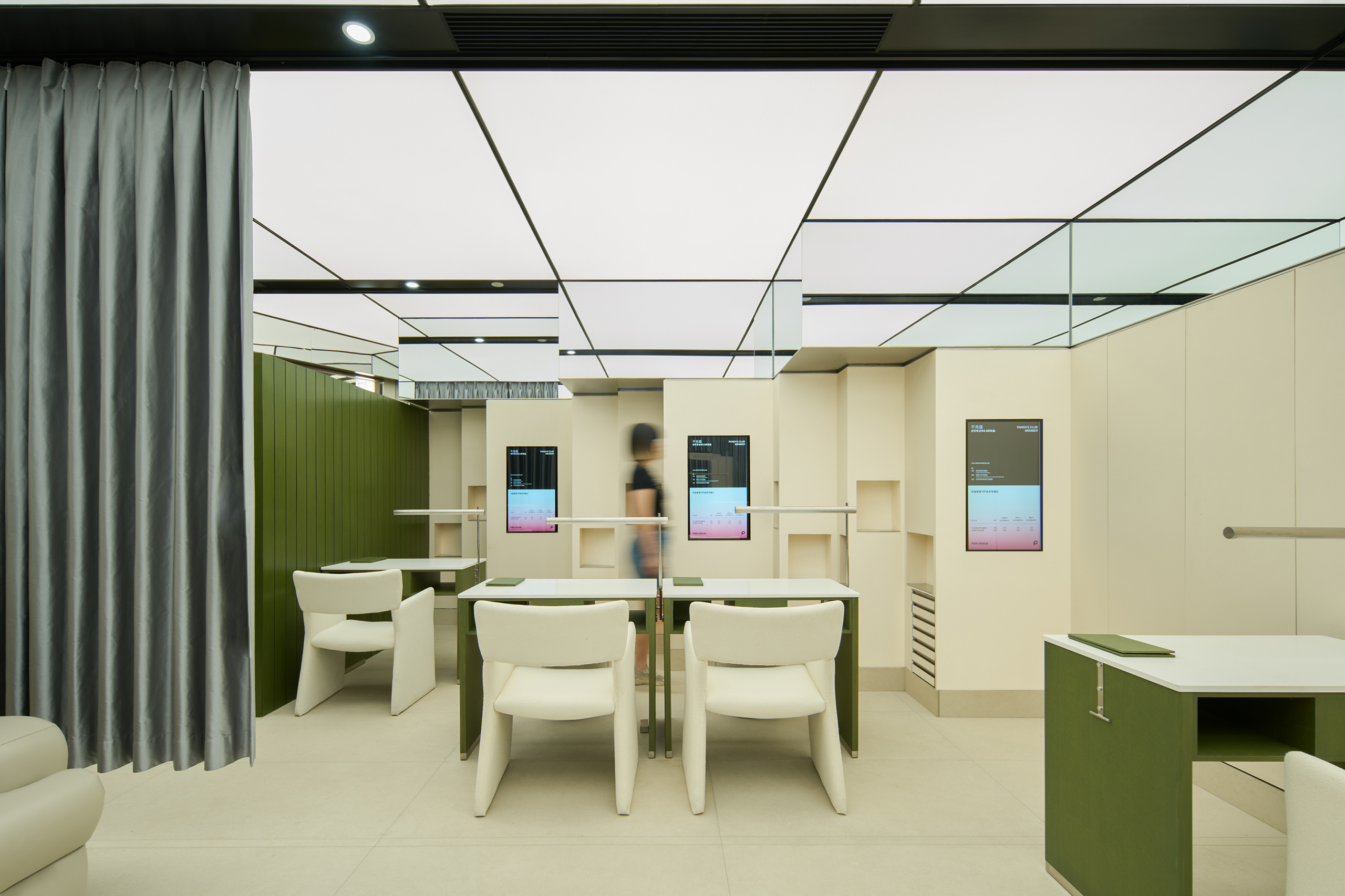
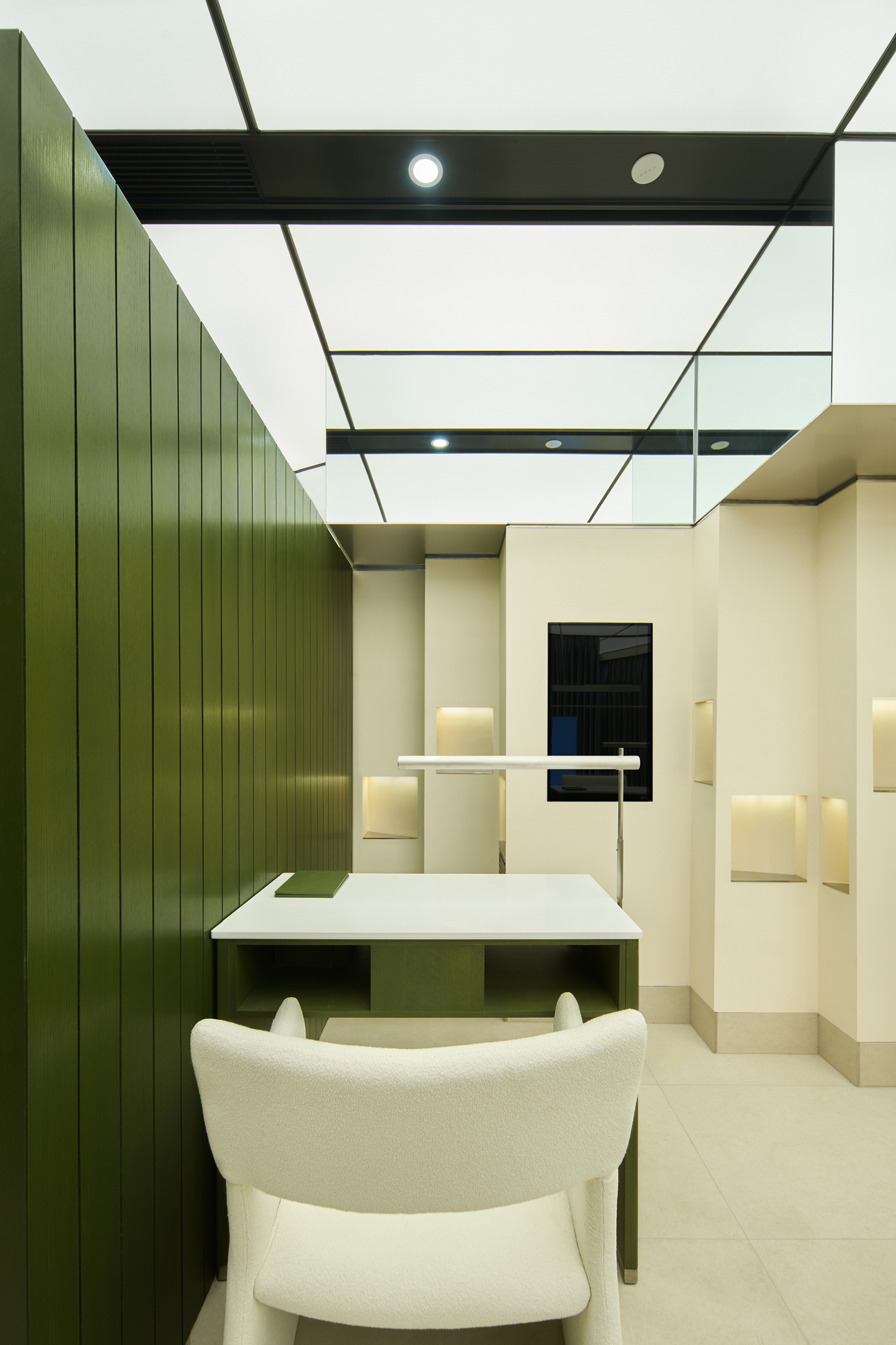
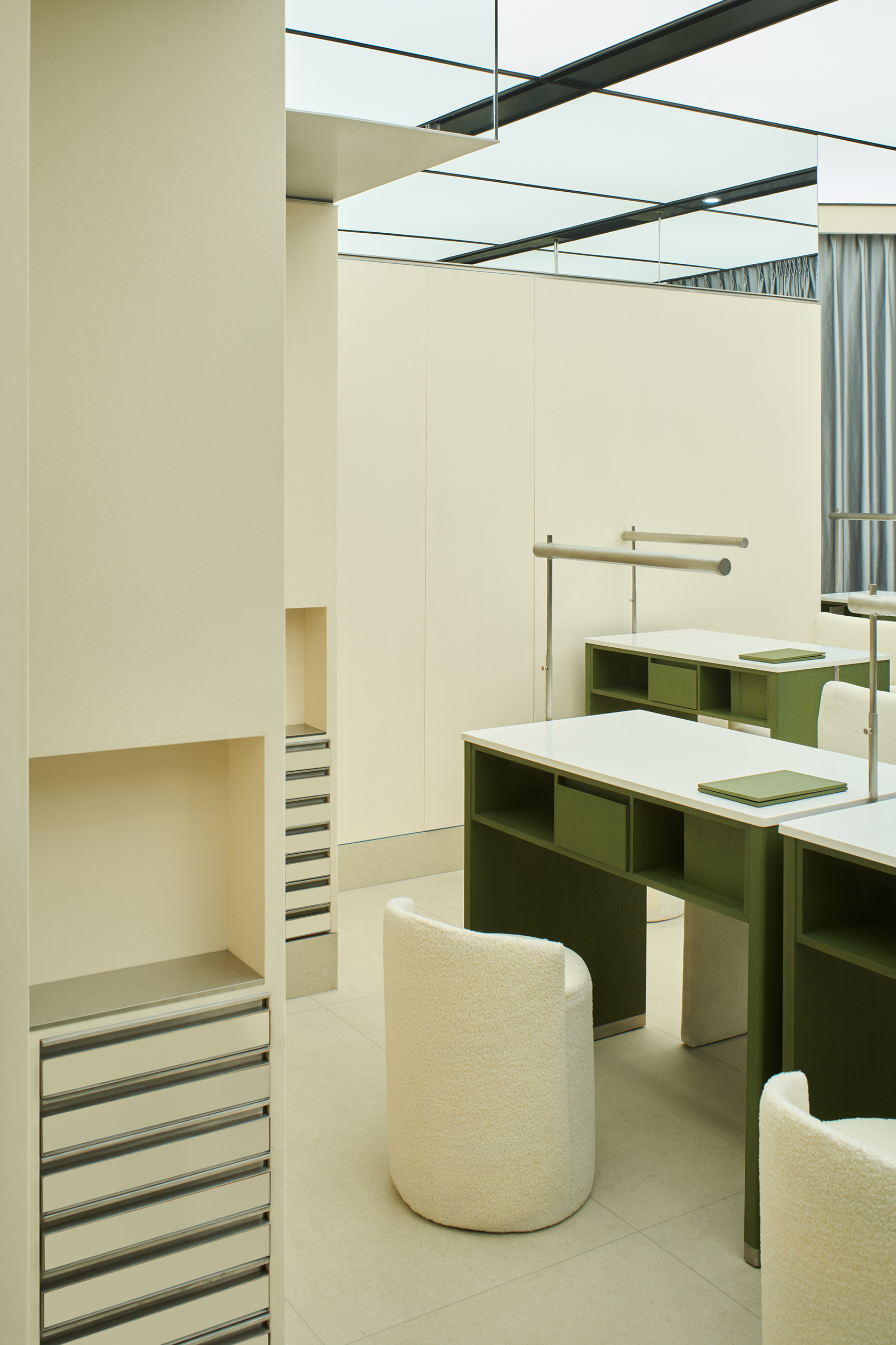
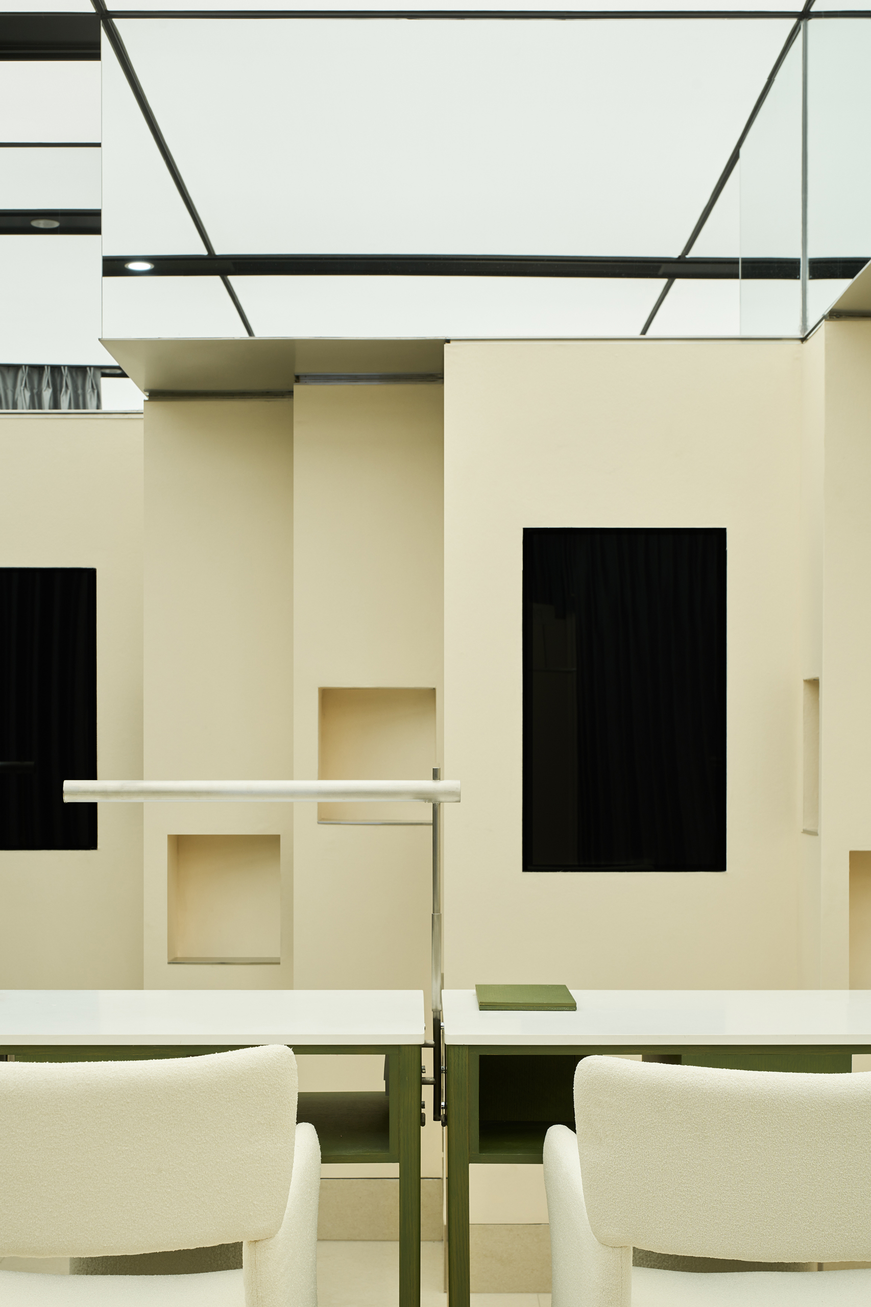
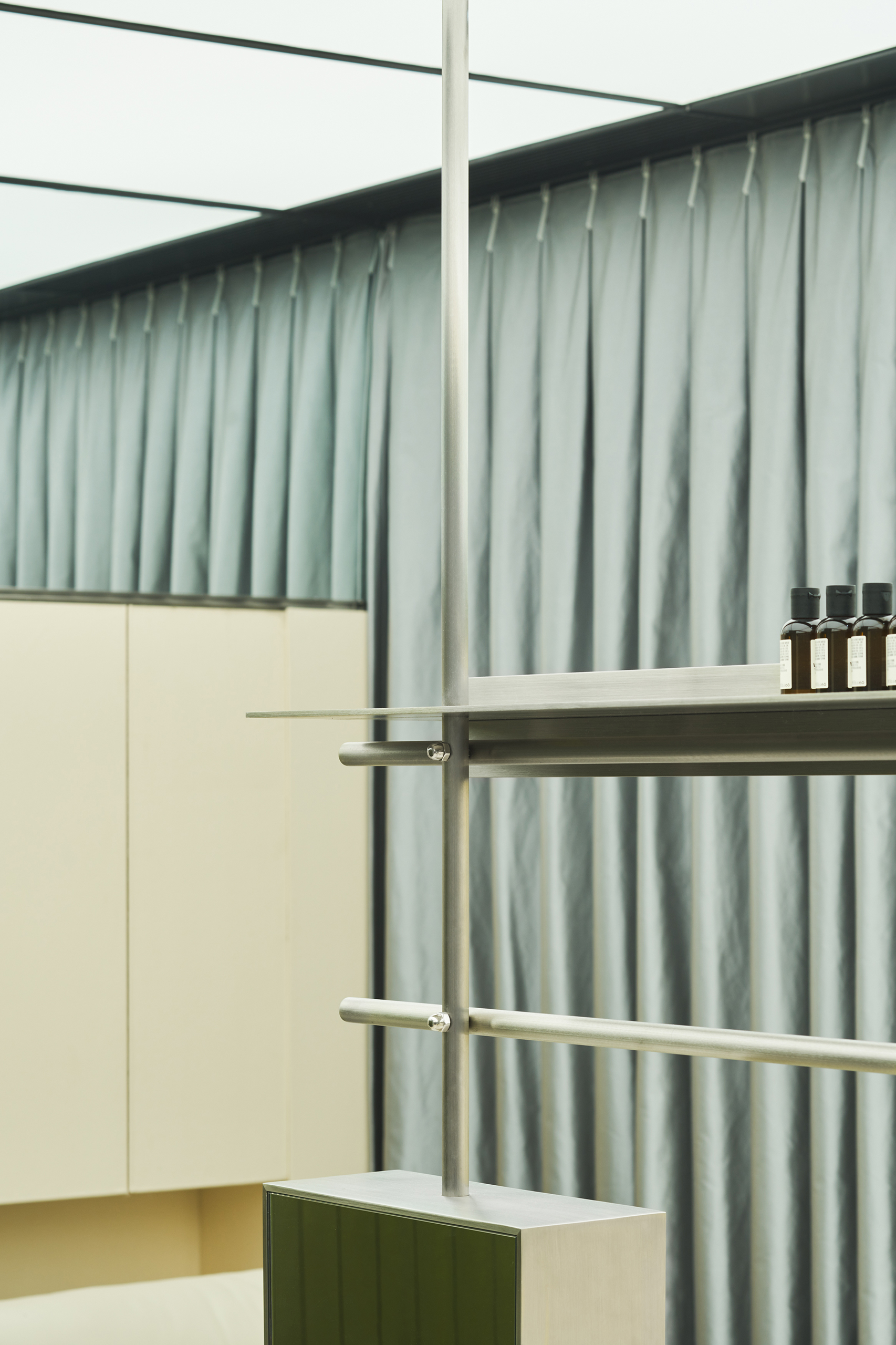
The green panels define the space but do not fully separate it. Together with the silver-gray curtains hanging from the ceiling, they create the fundamental structure of the space. The occupancy of volume is the perception of spatial envelopment. The meandering walls along the edges dissolve the original square space, creating an entirely new environment that offers customers a spatial experience entirely different from traditional flat coordinates. The rod installation is an adjustment to the spatial density. The placement of rods at the intersection of pathways, in turn, increases the depth of the space.
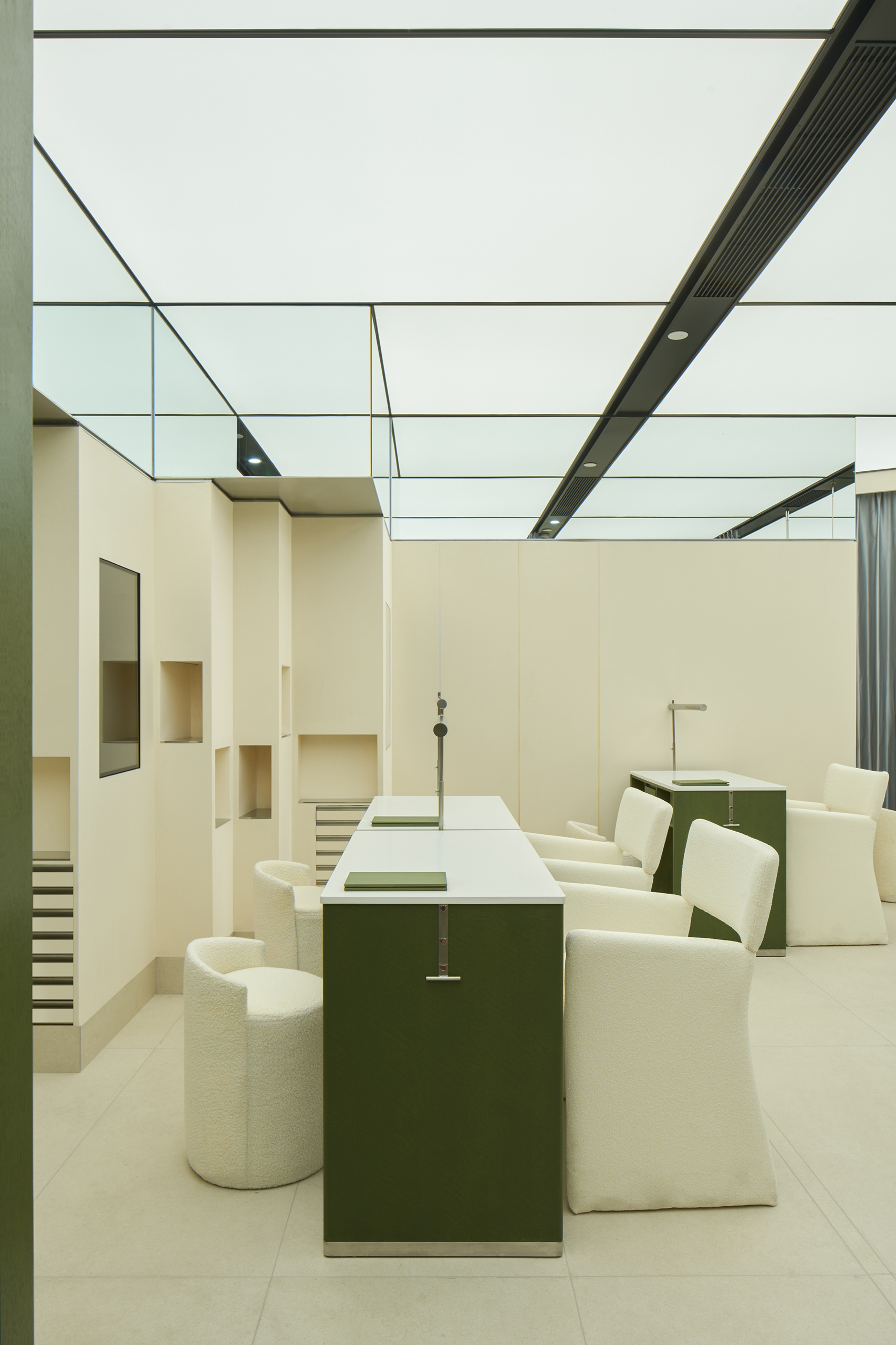
Mirrors along one-third of the wall in a circular pattern together with the full-light film ceiling make the boundaries between ceiling and walls disappear. It creates a feeling that the sight line can extend infinitely. Mirrors, panels, and curtains together create a multi-layered virtual space. This kaleidoscopic visual illusion extends the visitors’ experience from the real world into the virtual world, giving rise to a multi-screen play in space.
In PINKPANDA, pink is a brand’s spiritual core that transcends everyday cognition. Earthy-colored walls and green paneling convey a sense of nature, while acrylic and stainless steel connect to the future. A splash of orange-pink adds the finishing touch to the space. At the entrance, several square acrylic panels with brand information on top are hung with stainless steel nails on the green slanted wall. This device also offers high flexibility and expandability. The central installation serves both as a display for nail products and as a showcase for brand information. Its sleek lines and the use of mirrors also complement the spatial expression.
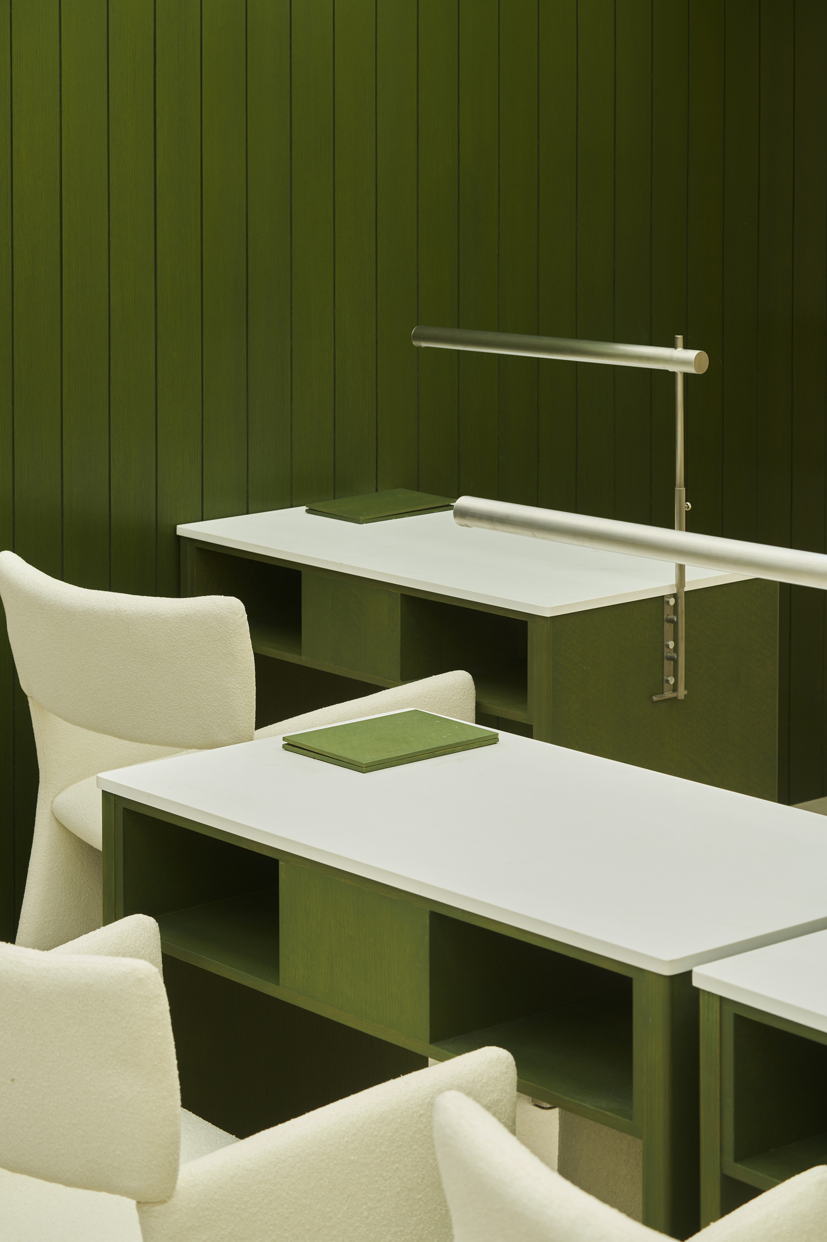
During the pre-design communication and market research phase, we discovered that the appearance and functionality of nail tables available in the market can not meet the requirements of the client. Therefore, we decided to design a nail table customized to fit the ambiance of PINKPANDA’s space. The table presented this time is version 1.0. We will continue to iterate based on user feedback. It has always been our effort at Ruhaus —— Let design accompany the brand’s growth.